

engle // olson
brand standards, logos + marketing materials
. client needs .
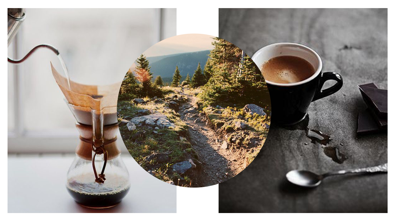
ENGLE // OLSON rebranded in 2016 when we both left our previous jobs and decided to bet on ourselves. We began to expand our creative reach from ‘just videos’ to photography, design, styling and social media. Previously working under Engle Videography, we needed a brand that worked with and outside of videography. We also needed colors that wouldn’t pin hole us to just the wedding world or the corporate world, but something that would be flexible.
. execution .
Using “Creative,” “Agency,” or “Production," all felt a bit too cliché as well as making us sound like we were a bigger business than we are. Being very passionate about being transparent and as a team of only two, “agency” didn’t sit well with us. At this same time we personally had made the decision for Jenny to keep her last name and add Engle when we marry in the Fall of 2017; thus was born ENGLE // OLSON.
Colors fell into place by allowing the mint and cream to be more of the wedding side, yet they still accented the bolder jade and tangerine as well. And finally we created our tagline to capture of outlook on life; to explore nature and this world to the fullest and capture the moments in which you find true happiness.


Acowsay Cinema
brand standards, social + marketing materials
. client needs .
Acowsay Cinema previously worked under the dual names: Acowsay Digital + Acowsay Weddings. They had two separate branches of wedding work and corporate work, each functioning with a varying color palette and fonts that needed to flow better with one another.
. execution .
We joined the two branches of Acowsay together into one brand conscious name, Acowsay Cinema. With this switch they were able to keep their original name and add a title to describe what they do at any level, cinema. We decided to create two separate brand standards, apart from the logo, for their corporate and wedding focused work.


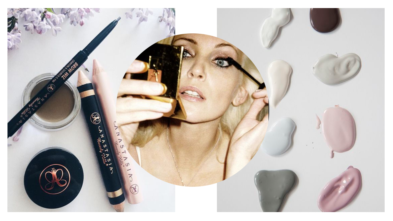
High brow
brand standards + logo designs
. client needs .
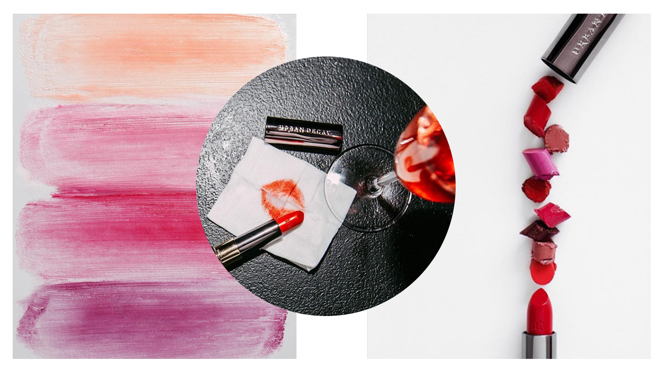
High Brow is makeup and hair artistry company. With ideas of minimalism in both text and color, yet chic, modern inspirational mood boards we needed to find a middle ground that also spoke to her elevated creative craft.
. execution .
Choosing a very monochromatic based color scheme with only small pops of blush, we incorporated that into her logo version board. We quickly landed on an abbreviation submark and varied throughout the process on logo names + designs. Below was our third logo version board. I personally loved version 2.


Sip | Savor Social
Business Overview
. client needs .
Sip | Savor Social is a marketing consulting company. They were looking to create digital + print materials to use to send to potential cliental. They wanted something that showed their capabilities plus previous clients reviews.
. execution .
In order to not weigh to heavy on the text side, we used several images within the design to help break up the copy. We also mixed in their secondary font + bolds to help achieve breaking up of the text.We utilized their fun color palette to help keep the design fun and within their brand standards.


amber budd atelier
brand standards, social + web reccomendations
. client needs .
Amber Budd Atelier is a local make-up artist + skin aesthetician. She was looking for social media tips + website assistance as well as a minor brand refresh. Something that would stay inline with her current standards of fun, bright + bold.
. execution .
We first focused on her color palette and replaced a previous secondary color with a more neutral based coral color. We then selected a few fun patterns + textures for her to work with throughout her brand. We slimmed down a few ares on the web that were a bit text heavy and focused on the important aspects of her business. We also created a fun new email signature + social links for her to utilize.


The Mindful journey
brand standards, logo designs + business cards
. client needs .
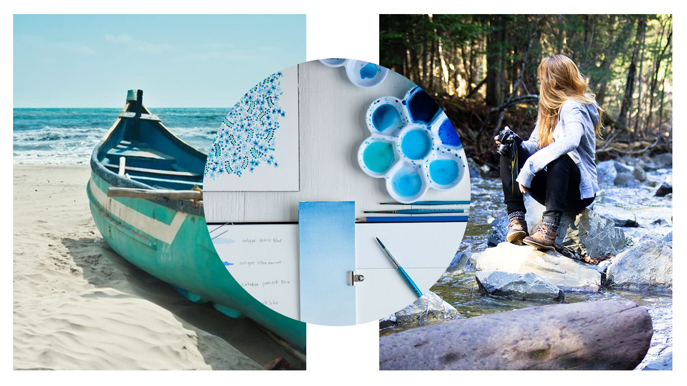
The Mindful Journey is a self improvement + internal growth business that focuses on mindful meditation. They were looking for a fresh new logo + business cards to accompany.
. execution .
We first created a mood board that would lead us in the right direction. Images of tranquil locations + watercolors was a reoccurring theme. We went with hues of blue and very simple text and focused on light and airy, which allowed the watercolors to be played up.


Styling
click to view work

Social Media
click to view work